Unlike viewing a photograph in a gallery setting, you are viewing these photographic images on your monitor. The brightness and contrast settings of your monitor can greatly affect the presentation of the images you are viewing here.
When these images were scanned, I optically compared the image on my monitor with the print that was scanned. They are as close as can be optically observed.
In order for you to appreciate the full tonal value of the images presented on this, along with other graphic intense web sites, I have included this calibration page.
Using the brightness and contrast adjustment controls on your monitor, adjust those settings until you can discern each of the various gray bars in the chart below.
For those of you who are a bit more picky, the chart below can be used to accomplish the same adjustment.
The colors in the next test pattern should transition smoothly from one to another with no loss of color quality from one red end of the pattern to the other red end of the pattern. If they don't, your monitor is either limited in its ability to produce full color, or you may need to specify a different setting for you video card. If you need assistance, please contact me or your favorite computer store.
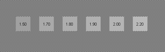
Finally we need to set what is called the gamma adjustment. Most of the photographic web sites were composed using a gamma setting of 1.8. Just for your information, most TV monitors are set at 2.2. Step back a distance from your monitor. You should be far enough such that the screen detail is no longer discernible as anything but a gray rectangle. The box that most closely matches the apparent gray surrounding area is the gamma of your monitor.
Back to the Gallery Page